
A Poet’s Brief Guide to Book Design
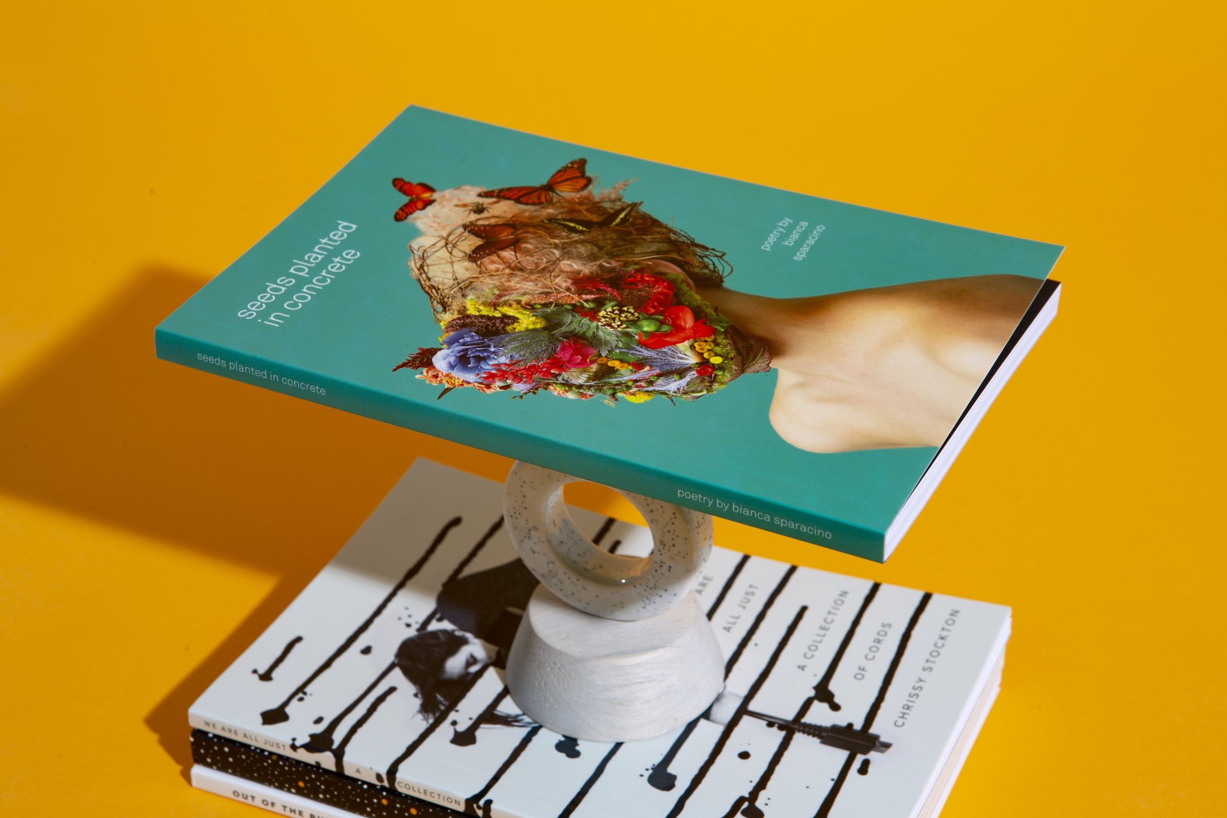
Why do some books look great and make you want to cuddle them?
Why do others look like poop?
As you move forward with your new book, consider this: A book isn’t just about the words inside, it’s an entire visual and tactile experience from beginning to end.
Two basic elements.
When laying out a book cover or a poem on the page, graphic designers pay attention to two basic elements—typography and visual hierarchy.

Typography.
Typography is the style and arrangement of type on a page. This includes the typeface (aka font) family itself, use of different styles and weights in a typeface family (such as condensed, light, regular, bold), and how the different words and letters are arranged.
Serif
Typefaces that have small, decorative strokes attached to the ends of vertical and horizontal lines. They tend to look traditional, professional, and authoritative, and be used for body copy or titles. Example: Times New Roman.
Sans Serif
Typefaces that don’t have serifs. They tend to look modern, stylish, and cleaner, and be used for body copy or titles. Example: Helvetica.
Script
Typefaces that look like handwriting and can make text look personable. However they are less legible and definitely not for body copy.
Display Type
Typefaces that are best used only for large titles and decorative purposes, because they can sacrifice legibility for style.